

Table of Contents
Your website is the first thing that greets potential customers online, the first handshake that can either open the door to new leads or close it shut for good. But the real MVP of lead generation isn’t your website. It’s your landing page.
A landing page is where your website visitors ‘land’ after clicking on a link or ad in Google, YouTube, Facebook or other sites.
Other web pages may have multiple goals, such as providing information or encouraging exploration.
However, landing pages are designed with a single focus. To get visitors to take action and increase conversions.
Notice how this section is not cluttered and all 3 elements are clearly visible. Keep things simple and to the point here so it’s easier for the user to navigate through.
1. Keep Important Elements Above The Fold
The first rule of building a good landing page is remembering to keep all the action above the fold. ‘Above the fold’ refers to the section of a landing page that users first see when they land on a website.
The human attention span is short – on average 8 seconds short – which is why you’ll want to make the most of it. As a general guide, keep these 3 elements above the fold:
- Headline
- Unique Selling Proposition (USP)
- Call-to-action (CTA)
Notice how this section is not cluttered and all 3 elements are clearly visible. Keep things simple and to the point here so it’s easier for the user to navigate through.
Take a look at this above-the-fold section for a LinkedIn specialist. As you can see, the headline and subheading directly addresses the target audience’s goals and desires.
“LinkedIn profile writing and training that brings connections and opportunities to you.”
Communicates the value proposition: enhancing your LinkedIn profile to attract connections and opportunities.
Desires: It’s concise, specific, and addresses the needs and desires of potential clients.
Benefits: It also implies a benefit-driven approach, suggesting that by utilising your services, individuals can expect tangible results.
“Transform your LinkedIn profile from the website you forgot you had into a flow of leads and business-building connections.”
Referring to LinkedIn as “the website you forgot you had” highlights the underused potential of LinkedIn.
This approach grabs the attention from prospective clients and motivates them to continue scrolling down, which is the main objective of your above-the-fold space.
2. Apply the Principles of Persuasion to Increase Conversions
A quick guide to get your landing pages to convert is to follow the 6 Principles of Persuasion from Influence: The Psychology of Persuasion by Robert Cialdini.
The author has detailed out how the following principles can transform your landing page drastically:
- Social proof
- Authority
- Scarcity
- Reciprocity
- Commitment and consistency
- Liking
We explore these principles in greater detail below.
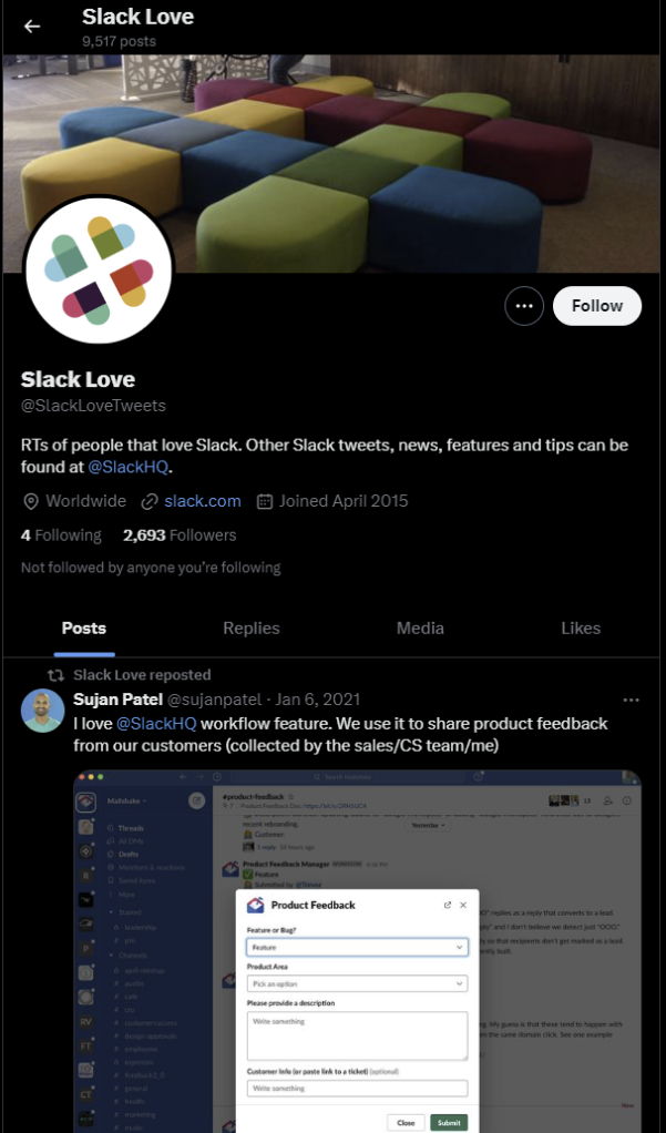
Social Proof
Have you ever decided to eat in a restaurant that you’ve never tried before based solely on the fact that it’s full of people? Or found yourself working late in the office only because that’s what most of your coworkers do?
Slack takes a creative approach to showcasing its social proof. The company runs an X account @SlackLove, where it collects and features positive shout-outs from its many users.
Authority
When visitors land on your page, their first question often is, “Can I trust this brand?” This is where showcasing authority can make a difference.
People like experts. Experts bring a level of credibility and assurance to the table. One of the ways you can signal your expertise and authority in your field is by featuring awards or endorsements on your landing page. Having these symbols of authority can help transform visitor apprehension into trust, and persuade prospects to take the next step with your brand.
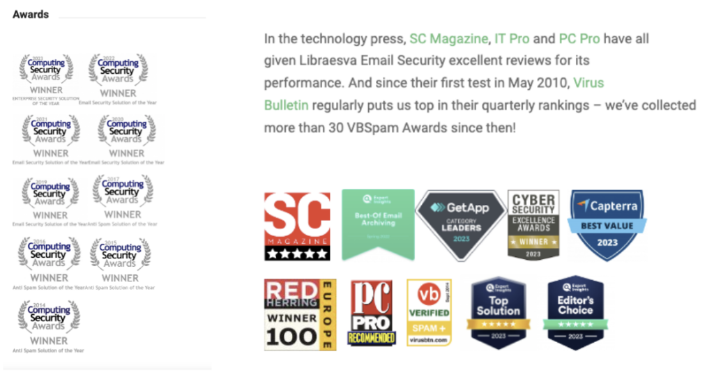
Email security brand, Libraesva, does a great job at demonstrating their authority by showcasing their impressive collection of awards and positive reviews from technology magazines and forums. This approach not only highlights their expertise, but also their consistent track record of excellence.
Scarcity
The psychology behind scarcity (Or FOMO for the modern audience) is quite simple. The more limited something is, the more you want it before it completely runs out. Customers’ mindsets shift from being concerned about the pricing to the fear of missing out on a purchasing opportunity.
Companies employ scarcity by offering limited time promotions or limiting the number of clients they take at a given time.
For example, take a look at this landing page belonging to Canva expert Em Connors:
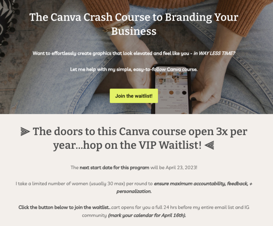
Em’s landing page for her Canva course is a great example of how businesses can use the scarcity principle to drive action.
“The doors to this Canva course open 3x per year…”
“I take a limited number of women per round.”
“Mark your calendar for April 16th…”
The copy capitalises on prospects’ fear of missing out on a valuable opportunity and being forced to wait another couple of months for the next opening. This heightens their sense of urgency and nudges prospects to make an immediate decision.
Reciprocity
Reciprocity essentially means, you give something to get something back in return. The psychology behind this says that humans naturally feel obliged to return a favour because they don’t like to be indebted to anyone.
Lead magnets are a prime example of reciprocity in action. A lead magnet is a specially crafted incentive, such as a downloadable guide or newsletter, offered by a business to prospects in exchange for their contact information.
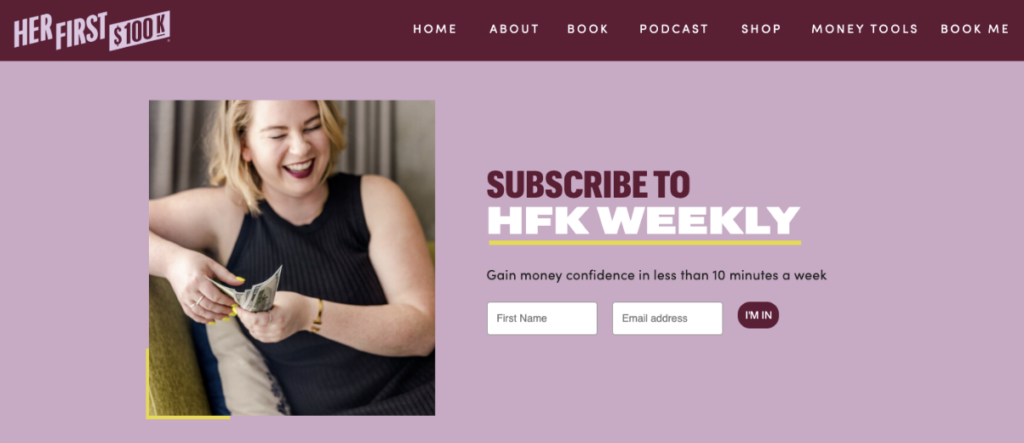
For example, Her First 100K presents a compelling lead magnet for the modern professional woman – A money management newsletter delivered weekly to their inboxes. In exchange for prospects’ name and email address, Her First 100K promises them a path to better financial literacy in under 10 minutes a week.
Commitment and Consistency
Commitment and consistency refers to our tendency to commit to something even if the motivation to see it through is no longer there.
Say you’ve started a survey but realised halfway through that it’s taking longer than expected. You’re likely to finish it anyway since you’ve already completed half of the survey.
With landing pages, commitment and consistency can be displayed by breaking up your “asks” into manageable chunks/steps.
In the example below, Uconnected does this by breaking up the steps a user needs to take to try their services for free.
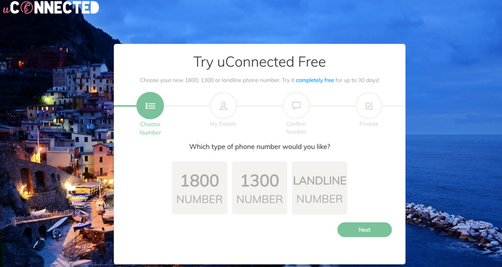
Breaking it down into 4 very manageable steps will make it more attractive for users to try out.
Liking
This principle follows the idea that people are more likely to buy a product or service from someone that they like. This is a tough principle to pull online – how do you convince people to like someone even if they haven’t met them in person?
Well, people like people who are similar to them, speak like they do and offer them compliments. These elements can be incorporated to make your landing page more persuasive and trustworthy.
For example, take this accounting website for agribusiness owners:
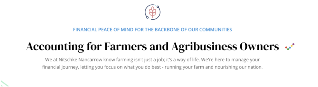
The headline and subheading taps into farmers’ emotions and pride in their profession.
“Financial peace of mind for the backbone of our communities.”
“We at Nitschke Nancarrow know farming isn’t just a job; it’s a way of life.
The copy acknowledges the hard work and dedication of farmers, while positioning Nitschke Nancarrow as an accounting firm that understands and respects the farming lifestyle.
3. Match Landing Pages With Ads & Target Keyword
The whole point of a landing page is to provide further information and opportunity for the user to act on what they saw in the ad. Therefore, what you’re advertising in the ad should match what is on the landing page and meet the users expectations.
People have limited time and will only act on something if the message is clear and goes straight to the point. Don’t waste the time of the visitor and give them the opportunity to act quickly on what you’re offering.
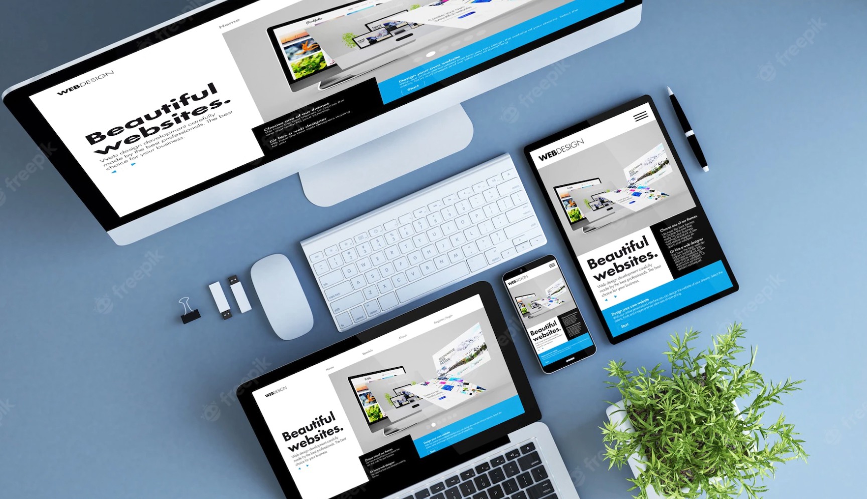
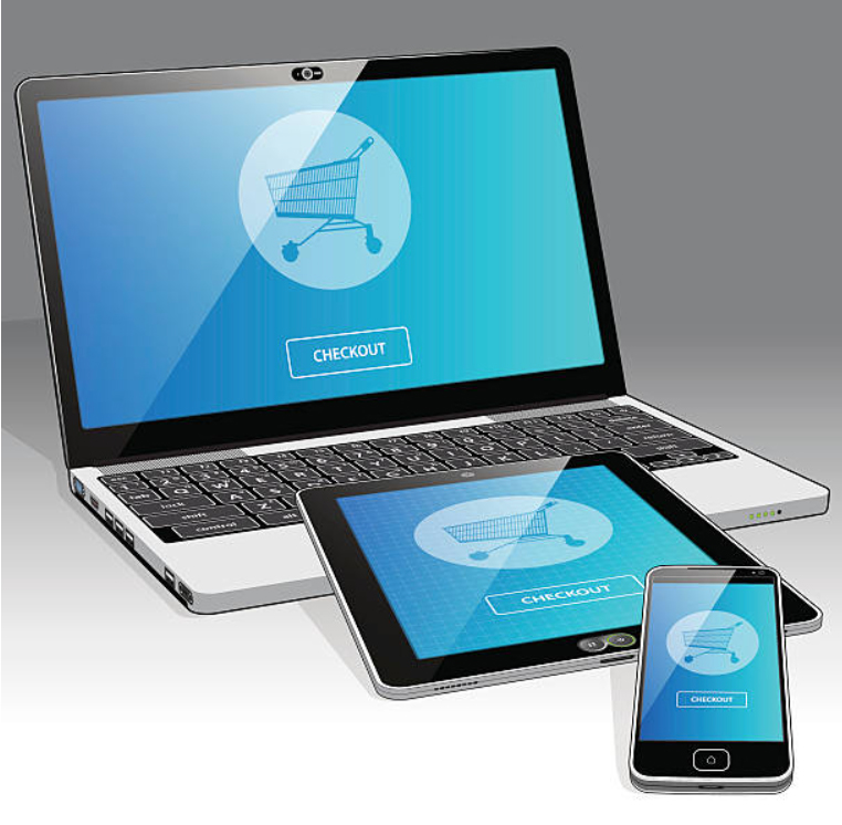
4. Mobile-Friendly Design
When you’re designing your landing page, make sure that it’s compatible with any device i.e. desktops, tablets and mobile phones. Not everything that works for a desktop layout would work for a mobile layout, so be prepared to shrink images or remove them entirely and change the positioning of CTAs.
If you prefer to play it safe, you could keep most of your buttons and forms in the centre of the page to avoid it from stretching and shrinking when it’s displayed on other devices.
5. Have A Clear USP
Why should consumers choose your product or service over what is offered by your competitors? What sets you apart from them? Whatever it is, users need to know this clearly from the beginning because, as we keep saying, their attention span is short.
When considering how to position your USP, you should first answer these questions:
- Who is your ideal customer?
- What are the pain points that your ideal customer deals with?
- How can your product/service be a solution to their pain points?
6. Write for a specific Audience
A persuasive landing page needs to speak to your target audience directly. To do so, you need to know who your target audience is. Once you’ve identified who you’re writing to, every word in your landing page needs to be directed at them.
Marketers are often paralysed with fear at the thought of turning people off, so they try to cast as wide a net as possible. But that results in websites that are generic, bland and forgettable.
7. Features vs benefits
Customers buy benefits, not features. It’s easy to get caught up in the cool features of your product or service, whether it’s a mood-adapting playlist or a fitness device that gives out snacks every 10,000 steps. But the only thing your customers are interested in is, “What’s in it for me?”
So shift the focus. Highlight how a mood-adapting playlist is convenient and reduces stress. As for the snack-dispensing fitness app – who wouldn’t want a treat and a high-five after a gruelling workout?
When you focus on selling benefits instead of features, you’re no longer selling customers a product or service. You’re offering them a better quality of their life. And that’s what draws prospects in.
8. Make it Visual
As the saying goes, a picture is worth a thousand words. In the case of landing pages, the less words, the better. If you can explain what you’re trying to say through a picture instead of words, all the better.
An added plus is that images contribute to a faster loading time, which will make your website visitors happy. 3 ways to use pictures on your landing page:
Display images of people
Show the function of your product
Represent the target audience and how the service/product can benefit them
Images of people
Pictures are more visually appealing than words and people resonate better with them. Images of people for instance capture the attention of users because as humans, we’re programmed to notice faces first.
What’s more, posting real images of you and your team members creates more of a genuine connection, compared to the impersonal, almost-too-perfect, stock photos. It allows your prospects to see the faces behind the brand, conveying a sense of trust and openness.
Paint a picture of your USP
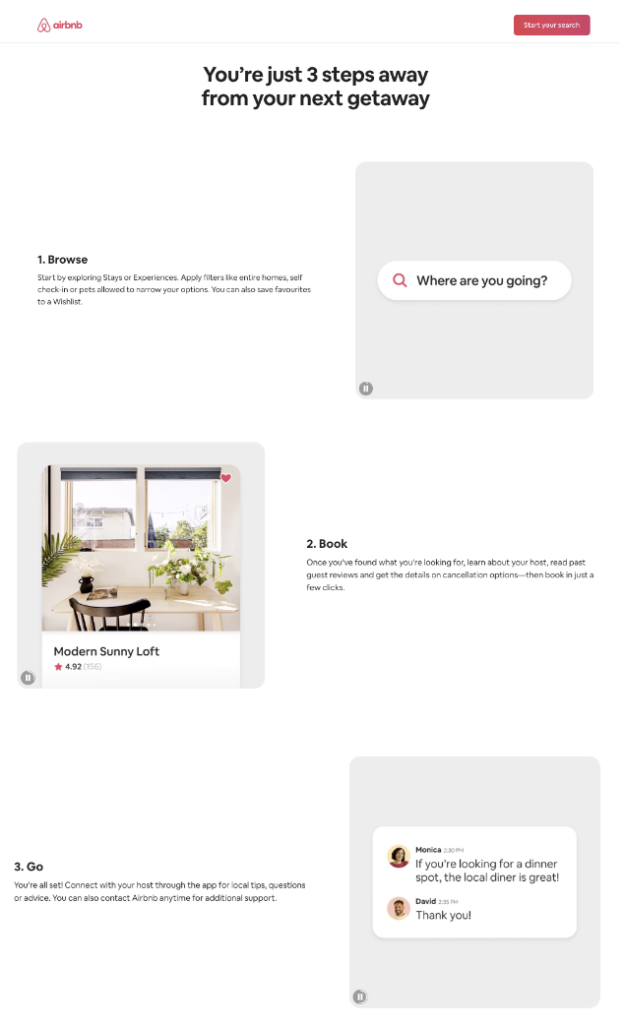
When crafting an impactful landing page it’s always better to show, not tell. Images and videos are valuable tools for effectively conveying your USP.
Take AirBnB for example. AirBnB uses video guides to demonstrate how simple it is to use their platform, in an engaging way. This visual approach not only reinforces their USP, but makes it more compelling to users as well.
9. Maintain An Optimal Loading Speed
Recount back to all those times you’ve visited landing pages that take forever to load. It’s really frustrating, isn’t it?
Making sure that your landing pages load quickly would make a huge difference to the experience of your visitors.
Run the Google Speed Test on your page to see how long it takes to load. Usually landing pages should load within 3 seconds or less or anything that’s as quick as possible.
Now that you know the loading speed, what can you do to improve it?
- Optimise images
This is the most common reason for slow landing pages. 3 ways you can optimise them is by:
- Getting your image size < 800kb but of course, the smaller the better.
- Choose the right file type. JPEG works better for images with big differences in colour while PNG is better for simple images with defined shapes.
- Use compression tools like TinyPNG or JPEG Optimizer.
- Host your videos somewhere else While hosting your own videos on your website can be good for SEO, it won’t help much with loading time.The solution to this is to host your videos on a 3rd party platform so that you can do without some of that extra loading time.
- Web host
Where you host your website will play a huge influence on the loading speed of your site. There’s a couple ways to do this:
- Shared hosting: Most affordable method but this means you’re sharing your website being hosted there along with others. So you will also be sharing storage space and processing power.
- VPS hosting: Virtual Private Server (VPS) is a mix between sharing and dedicated hosting. While you’re still sharing, you have dedicated resources which means better power but this comes at a higher cost.
- Dedicated hosting: This is the most expensive option because you have the server all to yourself. This is suitable for websites that experience very heavy traffic but it involves some technicality on knowing how to set up and maintain this type of server.
As for the more technical side, like code-related optimisation (e.g. Javascript/ CSS/ scripts/ bloated plugins), you’ll need to consult a web developer for that.
Start Upgrading Your Landing Pages
Most people don’t understand what it takes to produce a landing page that converts well and end up losing out on the valuable opportunity to convert. The best way to start is to understand the best practices required to induce action from users.
Refer to this guide when you’re producing your next landing page to make sure you’re on the right track. If you need professional advice on how to produce a good landing page or just want someone to do it for you, we’ve got you covered. Speak to our marketing consultants to find out more.